Case study
Light & Soul Weddings
An editorial site that filters for the right client before they write.
- Year
- 2026
- Sector
- Wedding photography
- Location
- Barcelona
- My role
- Art direction · Design · Development · Bilingual
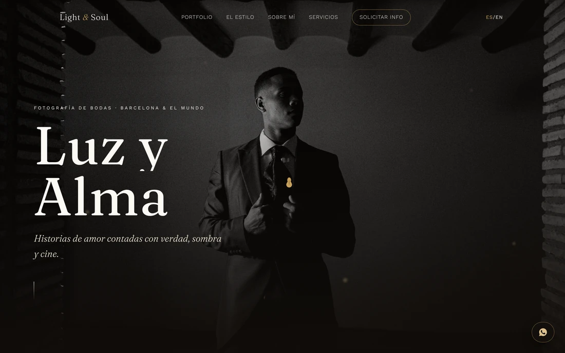
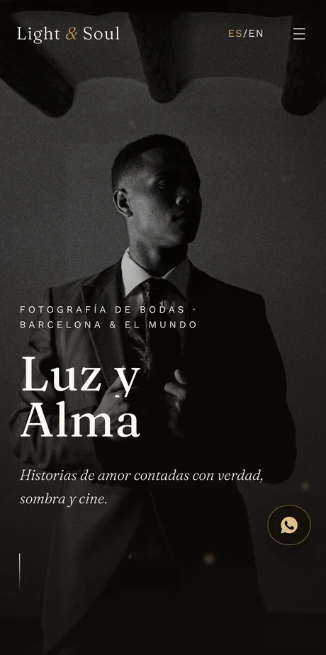
- Bilingual ES/EN
- Custom typography
- Editorial gallery
- Interactive FAQ
01The problem
In wedding photography nearly every site looks the same: a huge gallery, hidden prices, a form. The problem wasn't showing more photos — it was getting fewer and better enquiries.
02The strategy
Turn the site into a filter. A manifesto that says plainly how she works and for whom, placed before the gallery. Anyone who doesn't recognise themselves leaves — and that is a success, not a loss.
03Art direction
Art direction before information. A distinctive typeface, black and white dominant, and a cover that behaves like a magazine's first page. The image has air around it; nothing competes with it.
04Design
Twenty photographs curated by category instead of a gallery dump. A questions section that answers six real doubts before the client has to ask them over WhatsApp.
05Development
Bilingual Spanish and English, hand-built so the image load doesn't cost speed. Every photograph is served at the size it actually needs.
06The result
A site that reads like a printed portfolio and does half the sales work before the first message: whoever writes already knows how she works and has already decided it fits.
Got a project in mind?
Tell me what you need and I'll tell you straight whether it fits, what it would cost and how long it would take. If it doesn't fit, I'll say that too.